library(tidyverse)
library(ggthemes)
library(scales)
Descriptive Statistics
Let’s take a look at the ice_cream Data Frame, which details Ben & Jerry’s ice cream transactions across various regions and households:
ice_cream <- read_csv('https://bcdanl.github.io/data/ben-and-jerry-cleaned.csv')Some descriptive statistics for the averages of Ice Cream Price, Coupon Discount, and Household Income are shown below for each of the available regions
ice_cream |> filter(couponper1 > 0) |> group_by(region) |>
  summarise(mean_price = mean(priceper1, na.rm=T),
            mean_coup = mean(couponper1, na.rm=T),
            mean_inc = mean(household_income, na.rm=T))
# A tibble: 4 × 4
region mean_price mean_coup mean_inc
<chr> <dbl> <dbl> <dbl>
1 Central 3.44 1.39 123565.
2 East 3.44 1.12 119340.
3 South 3.36 1.22 130505.
4 West 3.29 1.03 125735.Household Size and Ice Cream Purchases
Along with this, we’ll look at a count of the prevalent household sizes in each region:
ice_cream_n <- ice_cream |> group_by(region, household_size) |> count(household_size) |> arrange(-n)
ice_cream_n
# A tibble: 36 × 3
# Groups: region, household_size [36]
region household_size n
<chr> <dbl> <int>
1 South 2 2870
2 Central 2 1993
3 West 2 1812
4 East 2 1797
5 West 1 1682
6 South 1 1604
7 West 3 1063
8 Central 1 1016
9 South 3 1005
10 East 1 971
# ℹ 26 more rowsggplot(ice_cream, aes(y = household_size,
fill = region)) +
geom_bar() +
scale_y_continuous(breaks = c(0,2,4,6,8)) +
facet_wrap(~region) +
labs(x = "# of Ice Cream Bought",
y = "Household Size",
fill = "Region",
title = "Ice Cream Purchases by Regional Household Size") +
scale_fill_tableau() +
theme_minimal() +
theme(strip.background = element_rect(fill = 'gray90',
color = 'transparent'))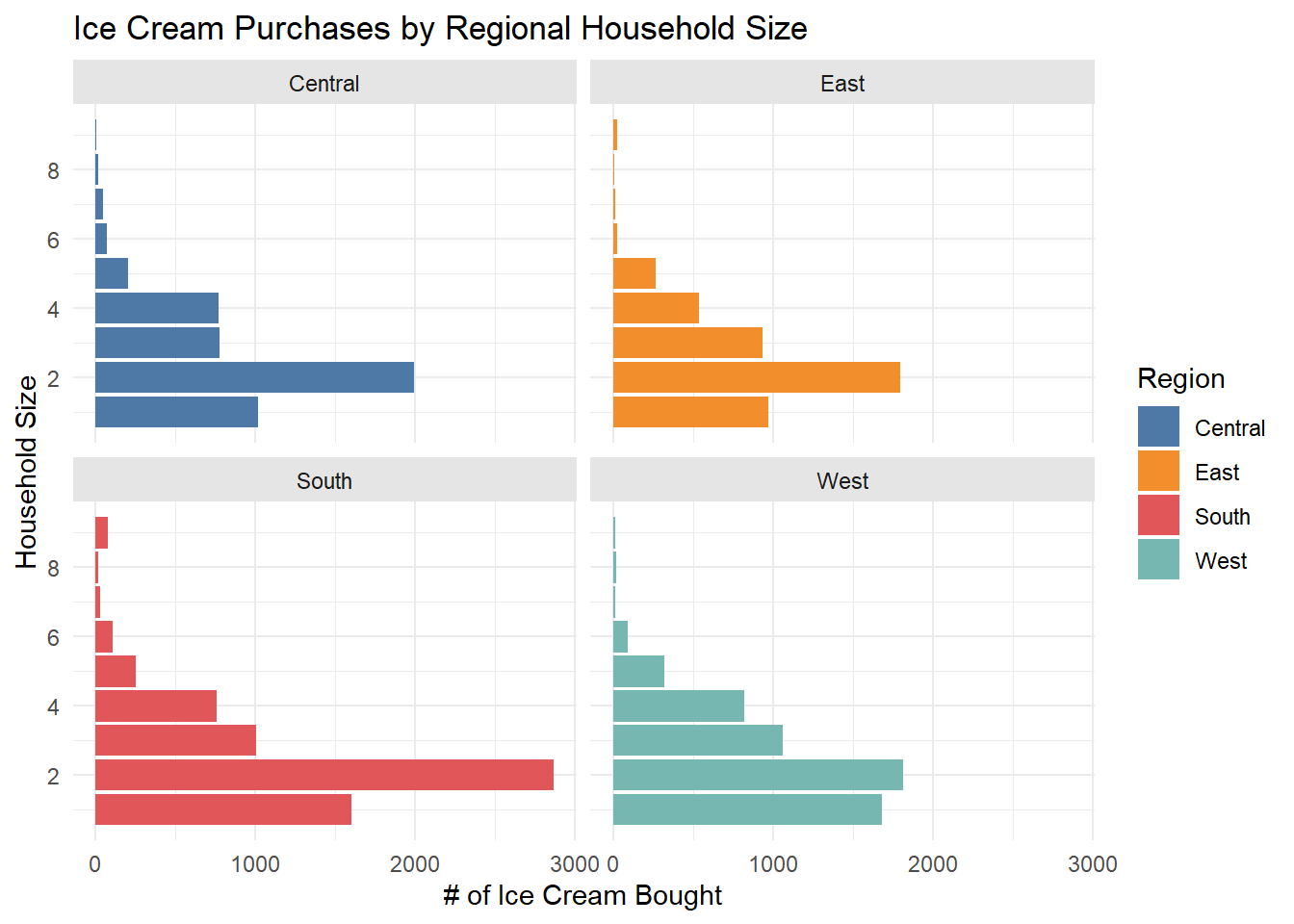
From this, it appears that there is a consistent relationship where 2 person households purchase Ben & Jerry’s the most, followed by 1, 3, 4, and 5 person households across the 4 regions. The South has the most purchases overall, and Central has the least.
Marriage and Ice Cream Purchases
Similarly, we can visualize how purchases are influenced by the income and marriage status of each household:
ice_cream2 <- ice_cream

ice_cream2$household_income <- as.factor(ice_cream2$household_income)

ggplot(ice_cream2, aes(y = household_income,
                      fill = married)) +
  geom_bar() +
  labs(x = "# of Ice Cream Bought",
       y = "Household Income Bracket (in dollars)",
       title = "Ice Cream Purchases by Income Bracket",
       fill = "Married") +
  guides(fill = guide_legend(reverse = T)) +
  scale_fill_tableau() +
  theme_minimal() +
  theme(plot.title = element_text(hjust = 0.5))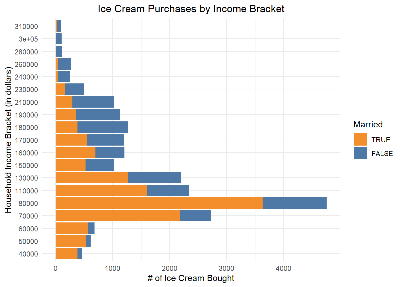
This shows that many of Ben & Jerry’s sales come from households between an income range of $70,000-$140,000 (because the 130,000 income bracket covers from 130,000 to 140,000), and that the ratio of married to unmarried households is much higher as incomes become lower.
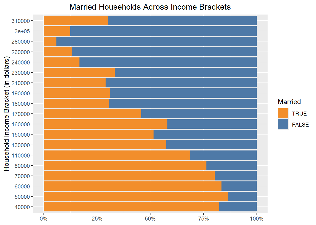
Visualizing this with a “filled” bar chart, we can more easily notice this relationship, where there is a high percentage of married, low income households:
inc_married_pct <- ice_cream |> group_by(household_income, married) |> summarise(n = n()) |> mutate(pct = n / sum(n))

ggplot(inc_married_pct, aes(x = pct,
                        y = reorder(household_income, pct),
                        fill = married)) +
  geom_col() +
  scale_x_continuous(labels = scales::percent) +
  scale_fill_tableau() +
  guides(fill = guide_legend(reverse = TRUE)) +
  labs(x = NULL,
       y = "Household Income Bracket (in dollars)",
       fill = "Married",
       title = "Married Households Across Income Brackets") +
  theme(plot.title = element_text(hjust = 0.5))